Know your colours

Let's find out why you should get to know your colours better, what exercises you can do to practice and how this will make you a better and faster artist.
In this article:
It's winter Down Under here in Australia and we recently had some long spells of wet, windy and generally miserable weather. I felt like doing something relaxing and remembered I hadn’t yet made a mixing chart for my Art Spectrum paints. In fact it was in my first video on YouTube one year ago (!) where I setup the palette and created a swatch sheet - you can watch it below. However, swatching the colours is only one step towards getting to know them.
So I decided to get nice and personal with my Art Spectrum watercolours by doing some relaxing colour mixing, swatching and then painting an abstract landscape. Although this is a fun, relaxing activity that might not be perceived as being necessary let me explain why getting to know your colours is actually quite an important and worthwhile exercise to make you a better artist.
Why is it important to know your colours?
Your paints or colours are one of the major tools you use to create, so if you know them intimately it will make the creation process flow more easily. Choosing and using your tools should be intuitive and not get in the way of your focus on the subject. If you don’t know how a colour will behave on paper or with another colour then this is a potential stumbling block that needs to be addressed before you can continue creating. In worst case scenarios not knowing your colours can lead to irreparable mistakes. However a good relationship with your colours can save you time and keep you focused.
Unless you always have a wide selection of colours available to you, it’s very likely that at some stage you’ll want to mix paint to make a new colour. If you know your colours then this isn't an issue, since you know which ones to use, the ratio of each and the hue it will produce. When this is unknown it can take a lot of time going back and forth to achieve just the right tint or hue, or even end up as the dreaded poo brown. 💩
By knowing your colours you have access to not just the pigments in front of you but all those possible through mixing too, essentially extending your range of colours.
This colour theory knowledge will also allow you to tweak colours, make a green slightly less warm or a touch more yellow to match the desired colour. Carrying a limited palette in the field (usually for weight or simplicity reasons) isn't restrictive since even with just the 3 primaries (magenta, cyan and yellow for watercolour) the rest of the spectrum is largely still available.
In addition to saving time, knowing your colours will help you make fewer mistakes and your paintings more cohesive. This is because with a limited palette where you've made mixes all the colours on the painting have a bit of the other surrounding colours in them too, helping to bring everything together.
How to get to know your paint better?
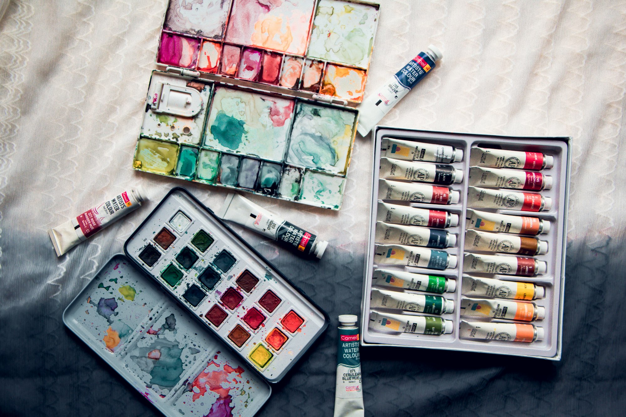
The first step to having a good relationship with your paints is to do your research. What are the qualities of your colours? This usually includes the information found on the label i.e. pigment number(s), brand qualities (such as if honey is used or gum arabic), granularity, transparency and lightfastness. Find out more about the attributes of different watercolour brands at handprint.com.
Understanding basic colour theory is essential too. If this is new to you then here is a short, clear article that briefly goes through this theory with lots of informative images and ideas for colour schemes.
Exercises
The following exercises will train your familiarity with the paints you have and colours you can make. In the next section you can see how I have approached them.
Swatching
Firstly, a very easy and relaxing way of getting to know your colours individually is to swatch them. Test with different amounts of water to see their granulation and transparency. This gives you a feel for how they behave on their own and with the paper or surface you use. You can also see how they perform when lifting and staining too.
Lots of artists make colour wheels to see the range of hues their palette has (usually in the order of the rainbow as it follows the light spectrum and for aesthetic reasons).
Colour mixing
From there you can move onto learning about how the pigments behave with other colours through mixing. Mixing charts and glazing charts (layering ability) are a good exercise and valuable reference for later so well worth investing the time into making. To create a complete mixing chart can take quite some time if you have lots of colours in the palette (e.g. there are 66 combinations for a 12 colour palette) however I would recommend making the full chart for future reference.
Simple painting
Finally you're ready to go on a date with your colours - explore their potential by making a painting! Try to keep these pressure-free by making them playful, simple and loose. The more dates you make with your paints the better you'll get to know them so develop your familiarity by using them regularly.
Examples
You can watch my video on YouTube if you prefer:
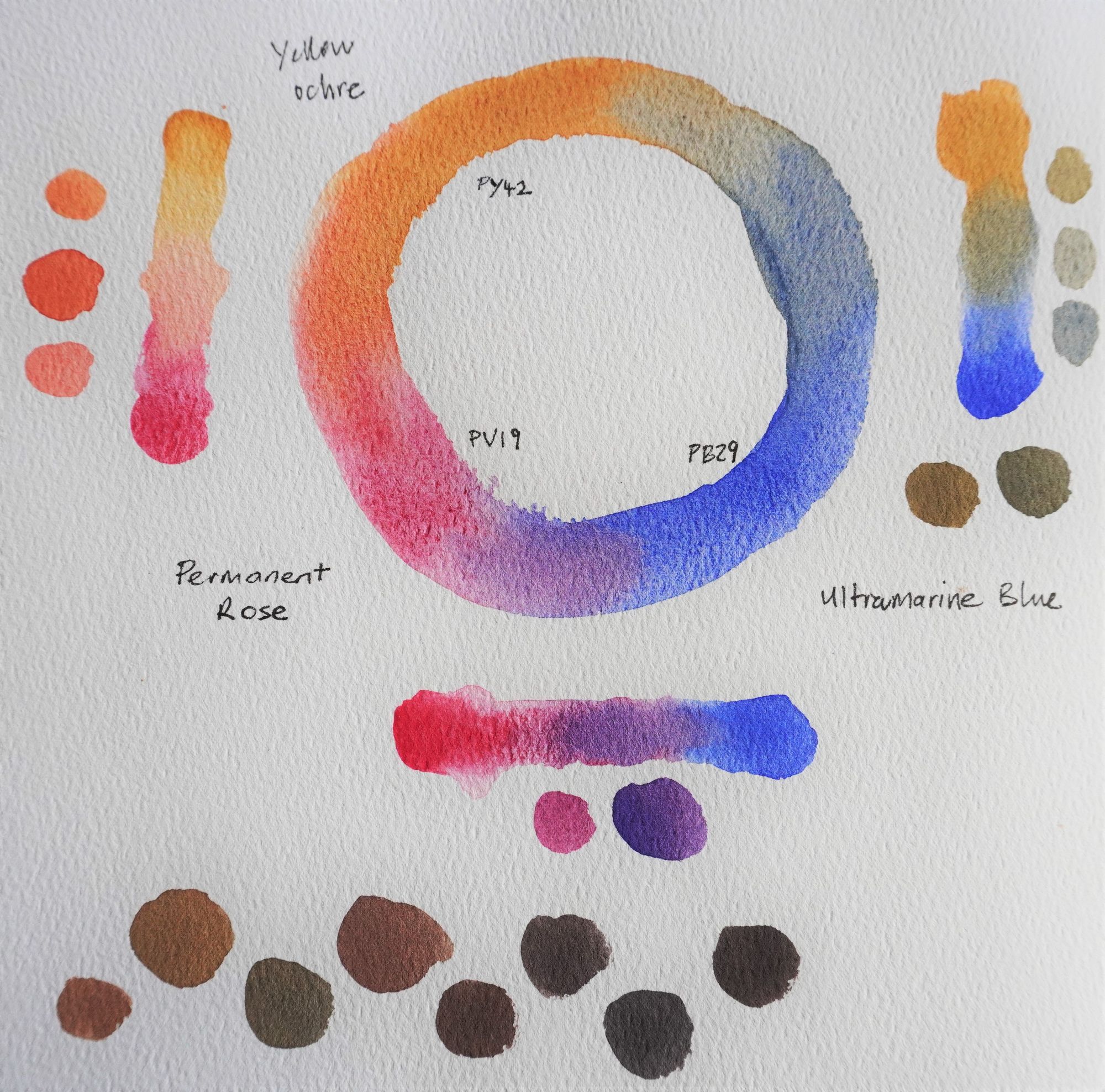
I started by making a colour wheel with yellow ochre, ultramarine blue and permanent rose (which isn’t in the landscape set but was bought for mixing purposes). Next I mixed these primaries to make the secondaries; orange, green and purple. I finished by mixing all 3 together to create some tertiaries; browns and greys.
This only explored three colours so I decided to swatch each colour’s mixes with the colours next to it in the palette. To begin I add pure colour at the top (starting with Australian grey) and then gradually add some of the adjacent colour (yellow ochre) to make mixes of different ratios until I reach the bottom which is just pure yellow ochre. My aim is to make a gradient between the two colours so that the middle swatch is roughly 50% of each. I continued this with each colour up to Flinders Blue Violet and will do the blues and greens another day.
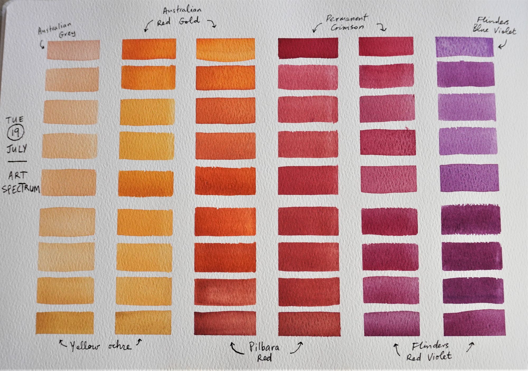
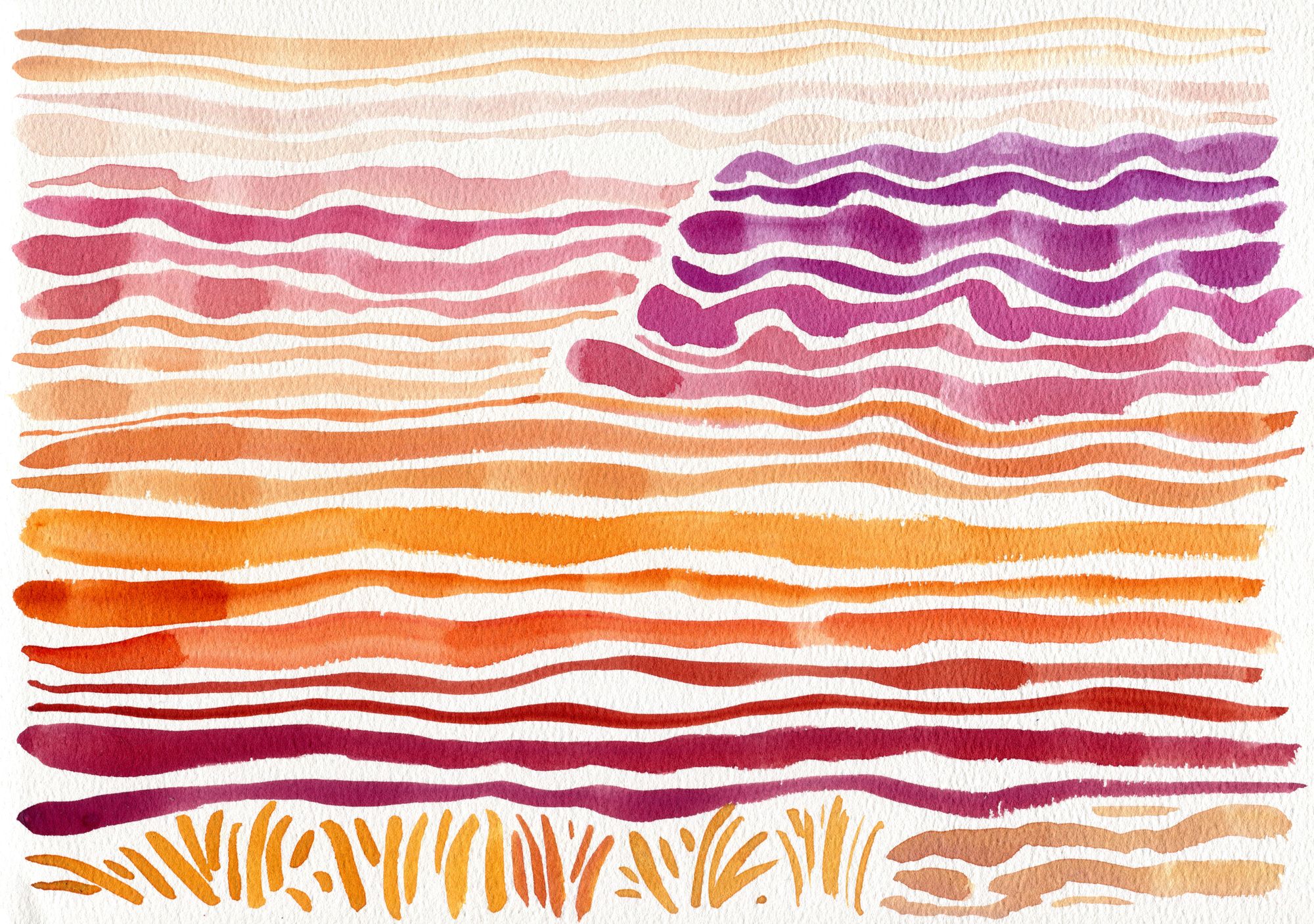
I then had a beautiful distribution of reds and purples on my palette so decided to make a simple painting loosely based on Lou Davis exercise and my memory of the Flinders Ranges in South Australia.
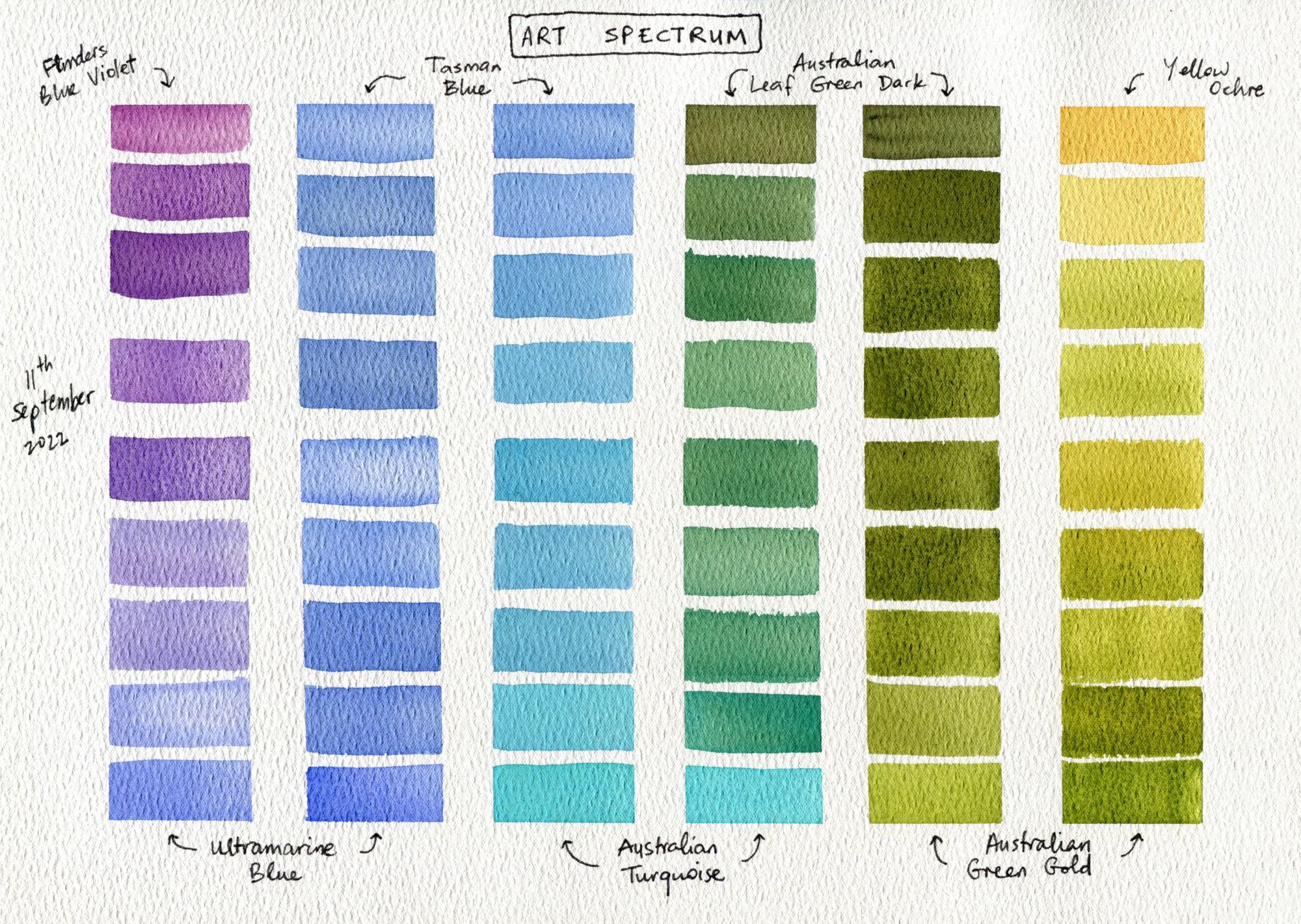
I later did the same for the blues. If you're ready to give it a try yourself, then why not have the video playing in the background keeping you company?
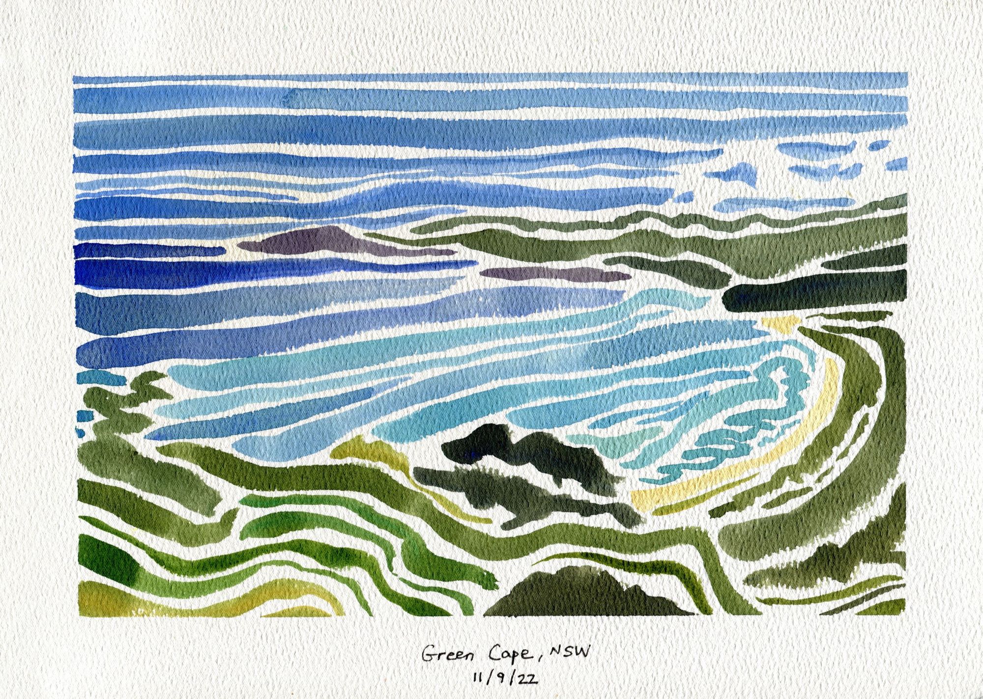
Here is the blues swatch page and abstract painting of Green Cape, NSW using the blues and greens:

Member discussion